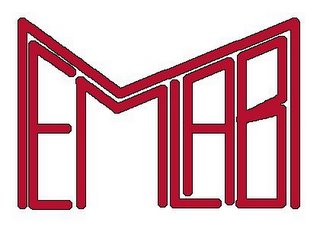
 This one was definitely kewl but the recursion/infinity not there :(.. the geek factor was also very low. Now am not a graphic designer so no flames for the crappy quality (BTW I made on gimp on debian...).
I started iterating on the design and came up with the following design:
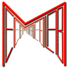
 This one is a bit more refined, definitely geeky, kewl, square and is infinite, metamorphically pointing to the essense of our lab working on short term memory, an infinite set of possibilities locked inside the hippocampus. But alas, the readability goes down the drain. I made the right hand side a bit more jagged, cuz that gave an effect of an infinite hallway and kindda improved the readability.
I have kindda hit a barrier here and due to my demanding schedule I have not thought much about the next version. It would be great if you guys can give me feedback or suggestions about the logo, something that has to be changed or totally scrapped down....
PS: My interview was good and the interviewer was so thrilled abt my job here that she asked really few technical questions and kept on digging about my work here... Anyway do comment on the logos

