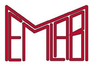
 This one was definitely kewl but the recursion/infinity not there :(.. the geek factor was also very low. Now am not a graphic designer so no flames for the crappy quality (BTW I made on gimp on debian...).
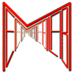
I started iterating on the design and came up with the following design:
 This one is a bit more refined, definitely geeky, kewl, square and is infinite, metamorphically pointing to the essense of our lab working on short term memory, an infinite set of possibilities locked inside the hippocampus. But alas, the readability goes down the drain. I made the right hand side a bit more jagged, cuz that gave an effect of an infinite hallway and kindda improved the readability.
I have kindda hit a barrier here and due to my demanding schedule I have not thought much about the next version. It would be great if you guys can give me feedback or suggestions about the logo, something that has to be changed or totally scrapped down....
PS: My interview was good and the interviewer was so thrilled abt my job here that she asked really few technical questions and kept on digging about my work here... Anyway do comment on the logos

Hey Sridar,
ReplyDeleteFirst thanks for working logo-->you efforts are much appreciated by all.
As you pointed out it's pretty difficult to discern what the logo says when you use the giant M around the "emlab". Maybe it might be a good idea to incorporate some sort of mathy-infinite-esq graphic into an image with the name?
thanx jennifer...whats a mathy-infinite-esq graphic?
ReplyDeleteps:My name is sridhar... I shud get a nick.. probably sid :)
do u know nething abt KISS - Keep it Short and Simple; ur design looks vry complicated and I can hardly read it. U mite wanna covert the E to e so that it cud atleast look geeky like exponent symbol and raise the other letters to the power.
ReplyDeleteMeanwhile check out my blog and post ur comments. I am giving it a new makeover.
hey I know that readability sucks...
ReplyDeleteHow is your suggestion doing justice to the requirements... its not square and not recursive.
hi sridhar.
ReplyDeletei find the logo quite interesting as far as the graphics is concerned.but to use it 4 a corporate identitiy u shud keeop in mind its readibility, and the context.when a logo is minimized or maximized ,it shud nt loose its charachter. m being a bit critical so dnt mind , i think this can b improved and the colors can b more techno...any ways its a gud task
hmm any specific suggestions... it needs to go with the site design too... memorysyr.edu
ReplyDeleteummmm are you on a temporary hiatus...Sridhar????
ReplyDelete:D
Megha